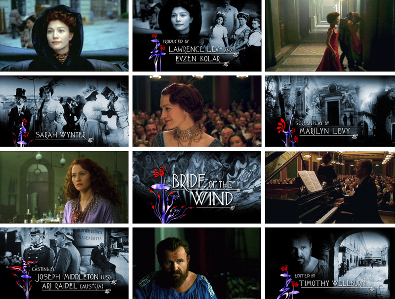
Bride of the Wind: directed by: Bruce Beresford
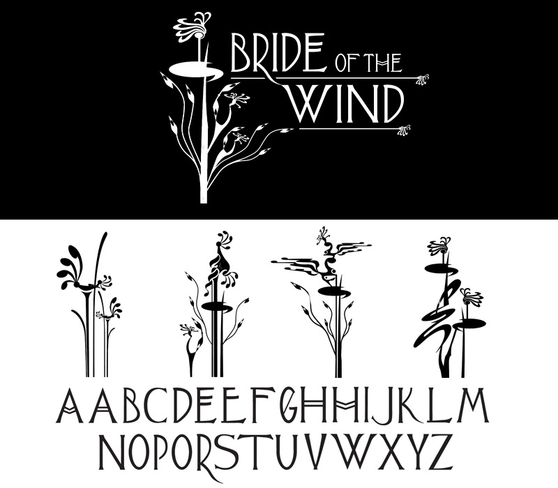
Director Bruce Beresford was looking to create a title sequence that reflected the style and aesthetics in poster art and lettering at the time period of the film in Vienna. The sequence would be composed of original monochrome photography to introduce the audience into this era. Working from the brief I created a series of abstract motifs together with a hand crafted font to be used for the cast, crew and main titles. The titles themselves were then positioned over the original monochrome photograph depicting the period. Titles and Optical effects: Cine Image Film Opticals.
Below: Original font design and main title with motifs for the title sequence before final digital colouring (above). 
Film Portfolio
Bride of the Wind
- Details
- Written by John Goodinson
